Wonder Woman and the Regime of Missed Opportunities
I took Regime Wonder Woman from Injustice as my second stream fix project, because this concept art reeked of wasted potential. And because as a big fan of the Cliff Chiangdesign I’d love to also prove that Diana can be done well while showing quite a lot of skin and doing a homage to Greco-Roman armor that fits her origin.
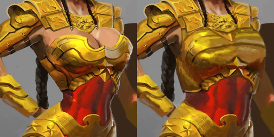
There were elements to this costume which deserved to stay – the helmet, pauldrons and belt joined with tassets. Boobplate with giant cleavage, high heels and unarmored crotch had to go. But first I gave Wondy a torso that can fit an adult woman’s internal organs. Funny how making her waist the right size all of sudden made her toned abs so much more apparent, even though they’ve always been there.
I remodeled her chestpiece into a half-breastplate that actually contains the boobs while retaining some of their shape. Did my best to not emulate the look of cleavage or draw the eye to where it would have been.
Got rid of the absurd high heels and edgelordy spikes from her shoes. Then duplicated some straps from the tassets to the front, as there was never a reason to put her crotch on display.
Final touches was giving Diana a tiny bit more distinct facial features: wider jaw and lips, aquiline nose. Minimal change, but hopefully for the better.
If there’s something I’d change if I had more time to work on that, it would be probably making her boots look less modern (and adding more gold accents to them) and drawing her right palm on top of her hip, which the original artists clearly was too lazy to do.
This was the first, but we keep coming back to redesigning Injustice regularly during our streams, because of how shamelessly “edgy” its sexualized female characters are. And because its in-game color palettes are the ugliest ever! This piece is based on an official concept artwork, so the colors are quite brilliant, but once rendered into the actual game, everything gets murky and desaturated to the point of blending with dark backgrounds.
the pose in this thumbnail turned out amazing and i wanted to share before i ruin it. (under a cut because i haven’t drawn the armor yet, just the awesome leg extensions)
ah, i’m finally finished with it! now, this is just the bare bones armor, without the robes, ornamentation, and external power plant. i’ve done it this way so that it’s as easy as possible to see what’s going on, or draw if you want. it’s also lacking the fan plates which would help protect the joints, although i’ve penciled in an example one. (i figure different orders can have different fan plate designs. that would be a good way to distinguish them while keeping any hypothetical sculpts fairly modular.)
i’m posting this now because i don’t want to keep you guys waiting any longer. soon, i shall post one with the robes and gloves, and some example weapons i’ve been toying around with. (sisters with polearms! :U)
design notes under the cut!
i may tweak the proportions a bit more, as there are some things that only become apparent after you’ve inked. as i mentioned in this post, the design is meant to emphasize the hips. this i have done by:
introducing a strong, smooth taper in the legs
pointing down from above with the inverted arch motif
making a band of high color and texture contrast around the hips
these efforts were a bit foiled by the addition of the pauldrons, gorget, and helmet. the main problem was the size of the helmet. a lot of people don’t realize how much bigger than your head a helmet ought to be, since artists tend to make them skull-sized or even smaller, without even considering that their subjects have ears. as you can probably see from the faint outline of here head left over from my pencil, even this helmet is pushing it. similarly, if i wanted the gorget to overlap with the helmet, it would have to be roomy to let her turn her head. (and even now, her range of neck movement is limited, which i made up for by giving her waist more flexibility.)
the high gorget is a staple of 40k non-space marine power armor, and its design fits with my arch motif, so i decided to keep it.
the pauldrons were meant to mimic the swoop of the original pauldrons as much as possible. i complained in this post that they were even more impractical than space marine pauldrons, but i still liked the iconic look of them and sought to preserve it as much as possible. even though my new design emphasizes the shoulders, it also continues the inverted arch motif of the chest and makes the chest look narrower than it actually is, so i decided it was acceptable. (the cut out half-circles at the armpit are usually covered by a besagne or tilt shield on one or both sides.)
the speaker/respirator thing had to stay, as it is likely used to amplify battle hymns and praises to the emperor. however, it’s dumb to loop the hoses over the pauldrons, as they would hinder the movement of the shoulders, and be much easier to sever.
in addition to the arch motif, i found places to put a bit of fleur-de-lys in the design too, so i’m quite proud of that!
to avert a future quibble, yes i am aware that it’s not a good idea to put the placart under the breastplate. that was a design decision to bring it more in line with other examples of 40k power armor, as well as reinforce the arch motif.
there is less connection between the breastplate and the bottom of the armor than usual for 40k power armor. that’s to allow for the iconic sisters of battle robes. how they would go on doesn’t make that much sense, but neither did it in the original design so whatever.
the feet were something i was toying around with to see if i could make a “heeled” design which would actually help with movement. the design is heavily influenced by real-world biomimetic robots and prosthetics for athletes. it’s designed to absorb shock from landings and add more spring to running by essentially increasing the length of the lever formed between the heel and the ankle. (incidentally, i think i may have figured out why space marine leg armor is shaped the way it is. the mechanism is simply hidden.) i think on the sisters, i’ll put wings around the ankles to give the mechanism more coverage. i’ve also designed a bigger, springier version for seraphim! their feet won’t touch the ground at all.
so there we go! if anybody has questions or comments, i want to hear them. next up: a portrait with all the fiddly bits!
now that i’ve laid out what elements need to be dropped from the sisters of battle design (see this post for an in-depth explanation), let’s talk about what to keep, emphasize, and add for a strong, interesting, and iconic look.
so, there are a few main things that are vitally important to the sisters’ identity as a faction, and around which we will base their design. in order of descending importance:
they are women.
they are power-armored.
they are religious warrior monks.
i ranked the elements this way for a reason. the sisters’ womanhood is a big deal because the faction’s meta-purpose is to stand in contrast to the all-male space marines. de-emphasizing their womanhood does them a disservice the same way sexualizing them does, as it sends the message that in order to be strong and competent one must imitate a man. plus, there are already plenty of factions where women are (or at least should be) present but wouldn’t be emphasized. the trick with the sisters will be to get that womanhood across without using cliched, insulting markers such as boobplate, skin-tight armor, and heels.
the power armor is the second-most important aspect, because of the simple fact that it’s what they’re wearing. if we fail to take that into account in our design, we get things like the pointless leather corsets the sisters were previously saddled with. regardless of the design of the armor, we must remember that it’s powered.
the fact that the sisters of battle are warrior monks heavily impacts the other two identities. (notice that i don’t say nuns. the orders militant are different from nuns in behavior, ideals, and organization; they simply use some of the same titles. they are more likely based on real-world knightly orders such as the templars.) in order to be a truly strong design, the sisters will have to reflect this identity in ways that go beyond mere iconography and trinkets.
how are we going to do all that?
we’re gonna do research! we’re gonna learn about biology, design theory, history, and maybe architecture! (this is on top of the research we’re doing about warhammer 40k, perception, psychology, and general human anatomy and range of movement.)
…
jk, i’ve already been doing those things for a couple years.
step 1: how to indicate that a design is female
this one presents a surprising amount of trouble for people, given how easy it is to indicate that a character is male. this happens for reasons that aren’t even necessarily an individual artist’s fault, especially a beginning artist. we won’t be going into why, as it’s a huge distracting can of worms that deserves its own megapost to do it justice.
suffice it to say that femininity in popular culture is widely reduced to a collection of stereotypes. skirts, bows, eyelashes, and pink for a younger character, and heels, tight clothing, bare skin, twisty poses, and–most importantly–lovingly rendered, individually wrapped breasts for an older character. a designer who wishes to go beyond that narrow and insulting representation will find little in the way of resources.
the point of the sororitas project is to go beyond that. to that end, and maybe to provide a resource to someone looking for it, i’ll try to synthesize what i’ve learned in the fields of biology, psychology, figure drawing, and reading a crapton of character design blogs.
the basic concept is actually really easy despite how difficult it is to get ahold of. to illustrate, i’ve drawn two extremely simplified human shapes, both comprised of a triangle and a rectangle. which of them is the female?
how are we ever supposed to guess when there aren’t any breasts anywhere???? but you already did guess, didn’t you? it’s the second one. wow, how did you do that?
the secret lies in the concept of taper. taper is where a form widens and where it thins.
here’s those same shapes with a little more humanity added:
this is really exaggerated for effect, and not everyone displays that pattern, but you get the basic idea. a taper from the hips is a powerful feminine signifier. (psychologically, more so than breasts.)
why aren’t women depicted with wide hips in popular culture? i have a couple of hypotheses, both boiling down to the same thing. the first is our cultural obsession with thin, non-muscular women. when women gain muscle or fat, it tends to increase the width of the hips and thighs more than anywhere else. thus, showing women with wide hips is a no-no, since that either means they are muscular or fat and therefore cannot be sexualized by the mainstream.
the second is a power thing. wide hips are a sign of sexual maturity, which connotes experience. furthermore, wider hips enable a wider stance, which connotes power. and experienced, powerful women are, again, difficult to sexualize.
since the point of the sororitas project is to reverse the sexualization of the sisters of battle, this is an important consideration. obviously not all sisters of battle would have wide hips. we’re not out to replace one stereotype with another. but their armor will be styled in such a way as to emphasize that area. as space marine armor emphasizes shoulders as a source of masculine power, sisters of battle armor will emphasize the hips as a source of feminine power.
step 2: how to indicate that a design is power armor
this one is much easier to research. there’s a lot of variation in the artwork, but when we look at games-workshop’s other power-armored models some trends emerge. (we’re not including their female models because they seem to follow entirely different rules.)
inquisitor coteaz is a really good model for demonstration. important characteristics of imperial power armor are:
head-to-toe coverage.
roomy enough to contain mechanisms.
power source often but not always external.
ribbed material underneath, shows through at the joints.
and last but not least, the structure is entirely points and curves.
if we stick to these principles, we can be reasonably sure that our new sisters of battle armor design will not look out of place in the imperium of man.
step 3: how to indicate that the design is a warrior monk
we could just drape the armor in votives, charms, and scrolls and call it a day. but i figure we’ve put this much work into it, we might as well put a little more. this one is going to be the most difficult for me, but fortunately i have a secret weapon. sisters of battle build fortress monasteries, and we know what they look like.
these monasteries, and the cathedrals upon which they are based, have some useful repeating motifs. we just need to choose one that doesn’t have straight lines in it.
The finished version of the Sister of Battle I posted a WIP of.
A little while ago I drew a fairly regular looking Sister of Battle and in the process realised how ridiculous their armour really is. This stuff is supposed to be power armour and yet it’s usually represented as little more than a form-fitting bodysuit with large shoulder pads and boob armour. Don’t get me wrong, I do think the original design is cool as Hell but even by the standards of 40k, it can be a little silly.
So I set to the task of redesigning the armour to better fit what it’s actually supposed to be whilst hopefully keeping as much of their iconic look as possible. Probably the most apparent thing to go was the boob plate, replaced with a much more basic (and not to mention, more functional) chest plate. I tried to build the armour up so it’d actually feel like it deserves to be called ‘Power Armour’ as opposed to just ‘armour’, this meant it started looking much less form-fitting and hopefully a little closer to it’s Astartes counterparts and therefor more deserving of its armour save.
Her hairstyle was just because I felt like it, a bit of a call back to the Rogue Trader era where there was a lot of punk influence, if you will.