Not so quick, but still dirty nebula painting based on @kaijuslayer‘s q&d nebula tutorial. (Which you should read before reading this).
In essence, this is the same process, except that it is a mix of my three attempts at learning Jake’s technique. Which brought a few tweaks
All three attempts were slightly different.
The first was a “I’ll follow the manual” thing :
The second was a variation with another colour than black as a background, or more accurately, making a nebula without any background colour. This used a drybrush technique :
The third came back to the text book, albeit with a desire to have colours blend more. To that end it used a wetting-the-paint-on-the-model method.
Flyers are great, they have a lot of surface to play with to really give this wet technique the room to shine. On smaller models though, the results do not achieve the impression of deepness of this Voidraven, but it is still worth the effort, at least if you look at the model from a playing distance.
–
The models I’m painting at the moment do not leave any black deep-space areas. They were undercoated with Mephiston Red spray paint, which I still deeply regret.
I would like to emphasis the fact that these techniques will crush your spirit until the last phase, where everything comes together and no matter how shitty it looked during the process, it will in fact, turn out great. I remember almost crying out of frustration on my first attempt.
STEP 1 : Getting started and doubting
Like with Jake’s tutorial, haphazardly paint your models with two base colours. Deposit the paint on a palette, take a lot of water on the brush, drop it on the palette, mix a little, put the blob of paint on the model. Really wet it, but not as much as it would immediately run. Aim for that “round drop of water on a surface” as a limit, running is desired, but not just yet.
Switch to colour 2, do the same, you might not need as much water this time, you’ll have to be the judge of that. Here your bubbles will connect and the paint from blob one will move around, dilute, blend a little but never really mix into another colour.
You don’t want them to become another colour, at least not too much, here a little bit of purple-ish blue or red in a very limited area can be acceptable, but if it turns outright purple, just wipe it away from the brush/model.
Play with the water : go take some with your brush and drop it on the model if it doesn’t feel like fun/risky to do. Let it go where it wants, or not, try turning the model around or up/down to achieve desired effects.
Let dry thoroughly before next step.
STEP 2 : feels like you did nothing of importance
Same than step one, but with layer colours, be a bit more precise with what you do, but you still have room for happy mistakes. As explained in Jake’s tutorial, you do not want to just paint over the deep blue, you want it to overlap a bit, be a bit smaller as to give the paint the idea of gradient, definitely use less water, but still, have a really wet brush.
You should totally have a nebula image from nasa or w/e as a model while doing this when you first try it out, it helps a lot. At least until you become familiar with nebula techniques.
STEP 3 : feels like improvement, or ruining the model?
Keep at it, go for even more lighter colours. In my case I didn’t use more than two red colours (Khorne and Evil Suns) but did use 3 or 4 colours for the blue (Kantor, Caledor, Lothern, and White if you want to count that in)
Keep going smaller (or not actually, in some places it can achieve nice effects) if you are perfectionist to the point of painting a replica of a nebula picture to the letter, these aren’t considerations that will bother you.
(sorry no picture)
STEP 4 : feels like it might come together eventually.
Fun part, take a bit of one of your base colours in a small recipient (I use icecube-making moulds) with the brush add a lot of water. Mix and apply all over the area. See Jake’s tutorial for an image and explanation it’s the exact same step.
STEP 5 : stars and shit
I’ve gotten lazy (that’s my trait in painting because I really don’t enjoy painting, if I could get to my end result without having to pick up a brush, I’d be so happy).
On the voidraven, I did every star one by one. It was okay, its a big model it needs to look good. On my bikes and this batch, I’ve used a destroyed brush to do like ten little spots at once, but they of course don’t look as good if your aim is to have nice round and small stars. What I did looks different, but not necessarily bad.
I added little parts where I almost dried-brush the lighter blue, other parts I used a wet brush, you have to test it out to see what works best for you. Most of the time I don’t know what I am doing and hope it’ll come out okay.
STEP 6 : INK/SHADE THE SHIT OUT OF IT.
By now the model looks okay, but it can look even better if you just use a big brush containing a lot of ink (shade) in it. It will give the whole thing deepness and brilliance, as well as a certain fading, as if it was a real paintjob made by the space elves, rather than feeling like it’s a paintjob from a hobbyist nerdzor.
I used an ink coulour that is not of the same hue as the earlier wash. In this case, I had washed with Khorne Red, so I opted for Drakenhof Nightshade as a finishing touch.
A lot of variations of these techniques will work. It is fun to try different things everytime or to have to find ways to adapt what you did on a 10cm x 5cm flyer hull to a 1,5cm x 1cm cape.
Well, I’m still learning myself, but here’s a few tips I usually keep in mind!
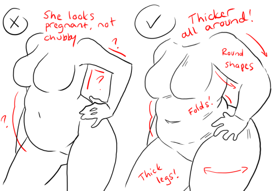
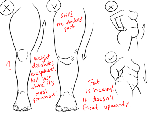
1.) “Fat” is not just a big belly!
Fat distributes everywhere, but not necessarily equally! Like at
any weight, every body is different and has an unique shape! Some keep a
hourglass shape, some become more pear-like, some are shaped like
teardrops or apples… but the basic thing is, fat doesn’t just choose
one place where it WON’T gather. It may not be as visible in some area
compared to another, but in real life, it’s reeeeaaaaalllllyyyy rare to
just find a person whose fat only stores in their bum, thighs and tits,
leaving their waist, arms, neck and etc slim. Keep the body pleasant and
thick all around, not just in the places where the weight-gain is the
most imminent!
Keep the round shapes in mind!
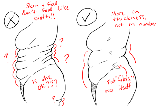
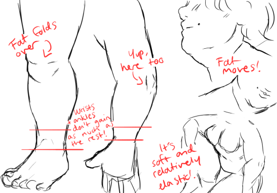
2.) Rolls! Folds! What are they?
What are they? Not something to be afraid of, that’s for sure!
Basically,
don’t hesitate to give your characters fat rolls. Skin folds, stretches
and moves along with the body, and so does the fat under it! However, a
lot of people who draw rolls tend to give the character many super
small ones — this is not how rolls work! Usually, the thicker the
person, the thicker the rolls — they increase in size, not necessarily
in number.
Rolls are the most preminent in places where the body moves the most, AKA the joints. Fat folds over itself and creates creases and ‘rolls’.
3.) HOWEVER….
(No references here, sorry!!!)
When we age, our skin loses its elasticity and it can’t keep the rolls and folds thick and perky. In our youth, our weight can be held up way better than in our elderly days due to the stength and adaptivity of our skin which disappears as we age. Thus, fat tends to droop lower with older people, and the rolls appear thinner. This can also happen if someone who has had a LOT of weight packed up suddenly losing a big chunk of it — the skin can’t adapt and will begin to “droop“ down and lower. Make sure to keep such factors in mind when drawing and planning how the weight of your characters should be carried!
And then, a lil tip that;
4.) Study references and real life!
If you yourself pack some weight or have access to internet, libraries or just life on the street, you will see how bodies at different weights and shapes work and move. Use references, see for yourself — try to find how fat distributes and especially, HOW IT FOLDS! Folds and rolls seem to be one of the biggest problems many have while drawing thicker characters, and that’s ok — we’re taught as a society that fatrolls are inherently bad and disgusting, therefore there are not many situations where we’d find ourselves just… staring and studying how the fat in our bodies works and moves. You’ll learn quickly, though!
I’m still learning myself, but especially since every body is different and the weight we pack acts in unique ways, it can be really challenging to find the ‘absolute’ right way to draw thicker characters. Don’t give up! You’ll get the hang of it eventually!!
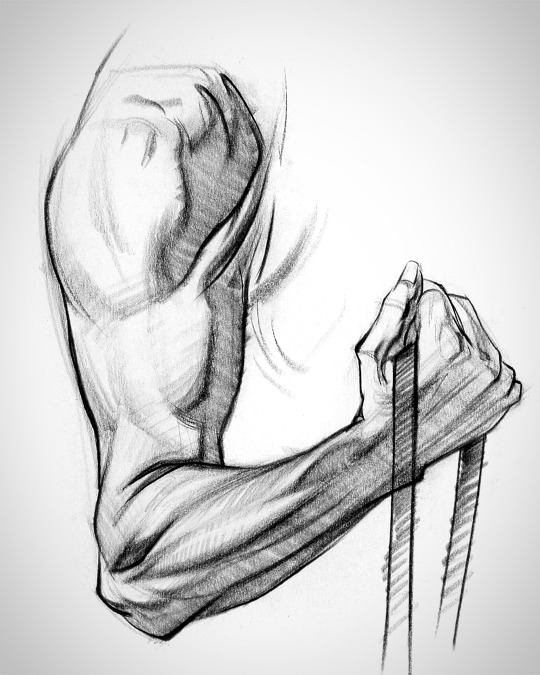
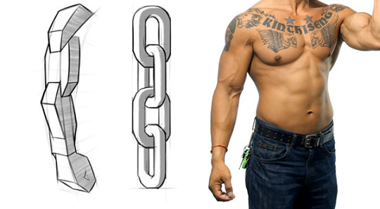
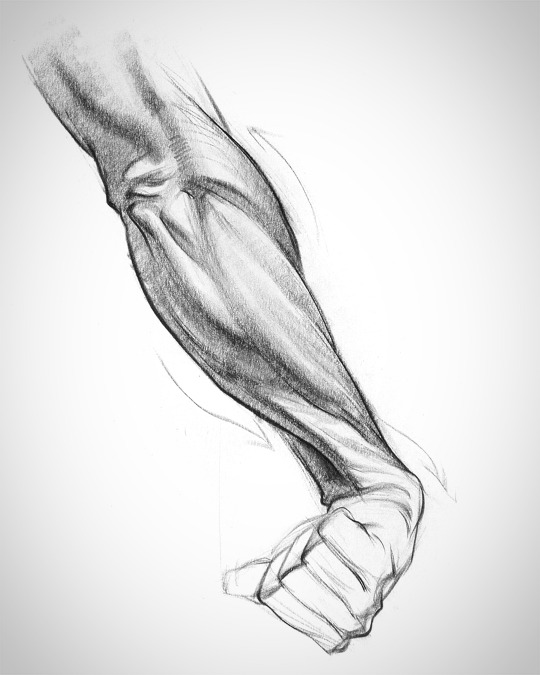
There’s three main groups: the flexors and extensors each take one half of the forearm, and the ridge muscles sit on top like a little tiara. Each group has it’s own unique form. Learning their anatomy will help you design awesomely dynamic arms.
Let’s try to make forearms manageable to draw. This is a body part most artists don’t quite understand. It can be real intimidating if you don’t know the muscles.
The arm has a simple chain design and the forms interlock down the arm.
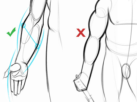
To avoid the snowman effect, use straight, angular lines and look for asymmetries. Compare the apex of both sides of the forearm to understand the curvature better. Notice that the flexors reach lower on the wrist than the extensors and ridge muscles.
Look for this kind of thing when you’re drawing the gesture of the muscle groups. A wave rhythm where the curve on one side leads into the next curve on the other side.
On the broader topic of Copics, I HIGHLY recommend following YouTube guru and licensed Copic Illustrator / Teacher Sandy Allnock on YouTube. She’s wonderful and has many videos across the board about copics (and water color and some other products she likes to use for her card making). She has a blog too, that has lots of useful information as well.
When I started out, I found this chart of hers very helpful for a good starter set of general colours. I personally swapped out some of the brighter groups for darker ones, because I almost only draw ‘dark’ material – from Wh40k stuff to Lovecraft, I just don’t use much truly bright shades.
On the specific topic of skincolours, it’s sort of trial and error. I am always experimenting with combinations for varied, diverse and realistic skintones. Trying out the combinations I see others, including Sandy use, etc. Here are some pictures of my own favourite skin ‘records’ (if you use copics, I highly recommend keeping track of your favourite colour combinations because you WILL forget). I use business card sized printed thingies and colour them in to try out combinations as well as record favourites. These are all taken under my daylight lamp, so they should be reasonably close to their real appearance, depending on your monitor settings.
I use the right one a lot for EC and Vallerie, for example. The left one is a favourite among various artists I know, but I don’t like it. Too orangy/barbie coloured.
The one skintone to rule them all, this is the combination I use for the Emperor although I use the shade a little heavier than is shown here.
One of my first attempts at medium dark skin, and still one of the ones I like best.
Plenty nice light combinations out there (*loosk at the camera*) I very much like the middle one for the regular “middle aged rugged white dude” look, it has that sort of “tanned” quality to it. The right one I am really fond of as well, its light but has a very beautiful red cast. Depending on how heavy you use the shade, it could be very suited to mesoamerican characters.
These are some of my older attempts, they look flatter than the others because I had not yet discovered the wonders of counter shading with purples. Heh. But still, they are quite servicable if you don’t own literally every marker like yours truly who cannot say no to markers. Ever.
Another recent set of favourites, that are the end result of a long and stressful path trying to render myself a red-cast skintone I liked for Magnus (left) and a more brown one for generic Thousand Sons (right).
So uh. Yea? These are some of my favourites, and the best way to get started is probably trying to see what markers they have in common across ones that you like, and get those, and try for yourself? These are mostly E10, E20 and E30 range markers, with some select higher Es and BVs for the shading. A good BV to get is the BV20s group. They work for most skintones. Alternatively, you can use warm greys, but I find it desaturates the skin / makes it look dead.