Hey there, true believers, today’s topic is Blood effects and how to make ‘em work for you.
Blood is a substance like few others. It has several unique visual properties, depending on the state you come across it. This effect can prove very difficult to capture in miniature. If you can nail it, you can add a ton of visceral carnality to a piece and really evoke an emotional response using subtle (and less than subtle) visual cues. There are a couple of tailor made products for the effect, Citadel’s “Blood for the Blood God” technical paint, and Tamiya’s “Clear Red X27″, but I’ve found you can get a higher degree of verisimilitude mixing your own gore.
If used appropriately, You can use it to create motion/action in your pieces, whether through the direction of a splatter or even active bleeding.
SPLATTER EXAMPLE
BLEEDING EXAMPLE
Being able to capture these moments successfully can lend a ton of dynamism to a medium that is often comparatively static. Combine that with the emotional response that blood evokes in people (up to the extreme of some people feeling unwell at the sight of it), and you can see how carnage can be a powerful tool to employ as an artist – Provided you have mastered the effect.
In the same way a well done blood effect can tie a bow on a scene, a poorly executed one has a decidedly more distracting and comedic effect
RED FOR THE RED GOD
Enough Jibber Jabber, lets talk blood theory!
THEORY
Blood has several different distinct visual states, depending on its age, viscosity, depth, source, etc. For simplicity sake, and since we’re limiting the application to miniatures, we’re only going to discuss three types of blood, as these will be the ones most often visually depicted in miniature. This is also the reason why painting a bit of red on your weapon never really looks right. The stuff has depth, yo.
These are new blood, old blood, and dried blood.
The whole point of blood is to carry oxygen around to the cells of the body it resides in. Even the blood within your body has different colors, depending on how recently it was oxygenated. The difference can be quite dramatic, especially taking into account how much we need to exaggerate color contrasts in miniature for the effects to play correctly on the eye.
NEW BLOOD VS OLD BLOOD
Both of the examples in the image above are fresh and from the same body. The one on the left is freshly oxygenated arterial blood, and the one on the right is less oxygenated venous blood.
Both are still fresh, in that they have the same viscosity, but there is already a pronounced color difference in between the two. For the sake of miniature, we’ll generally be trying to capture the gem like quality of venous blood, in our pieces, as it has a greater visual interest in it’s depth of contrast, and will play more like blood at the scale.
Another thing you’ll need to take into account, is the characteristics of dried blood.
BLOOD MEAL
Blood has a very high iron content, and iron oxidizes (rusts) when it is exposed to oxygen. The image above is literally freeze dried blood. Notice how brown/violet it becomes when drying. If you’re creating a scene with old blood smears, or trying to tell a story where something violent has been happening for a long time in one spot, it is important to incorporate these colors (in a matte finish) along with the fresher, ‘wet’ blood effects.
LIQUID DYNAMICS
Blood is clearly a liquid, though to see the way some people apply it to miniatures, you wouldn’t know. I’m a big fan of the “Rule of Cool” with regards to art.
If it looks awesome, I don’t care if the kid couldn’t life a giant sword, the mech would snap in half at the waist or a dude would melt from wearing armor made of lava.
The real problem is that in order for blood to look awesome, it has to follow the physical properties that govern stuff in the real world.
It’s important to be aware of the sense of motion that you’re attempting to create with your splatters. Look at how both the angle changes the shape/direction of the splatters, and what the depth of the blood does to it’s opacity and overall color. See how it darkens substantially as it lies thicker against the white backdrop. These are all factors to be mindful of, when generating the blueprint of your effect in the mind’s eye, prior to execution.
COLOR THEORY
The painting of blood, without the use of a gloss medium, requires usage of the range colors above. Often, the mid tone red is selected, and then taken down the spectrum utilizing purple, blue or black, until it reaches the desired deep tone. You can accomplish this using any particular brand of paint you find most desirable…
We’re going to cheat though.
I’m going to cut through the color theory lessons, and show you how to get a convincing depth of blood using low opacity paints and gloss medium.
WARCOLOURS WAY
Warcolours are fantastic for this application, as they’ve a lower opacity than other paints, allowing you to layer them on top of each other without entirely masking off the surface layers below them. This special translucency allows you to build up depth, without worrying about your blood effects become opaque and homogeneous blocks of red.
The steps are exceedingly simple.
1. Mix Red 5 with gloss medium (and a tip of purple/black, if you’re feeling rowdy). 2. Dip a course bristled brush in the pool of paint (I use an old toothbrush) 3. Drag your thump across the bristles, flicking the paint in the direction you want it to splatter. 4. Mix Red 4 with gloss medium (and a tip of Red 5, if you’re feeling rowdy) 5. Repeat Steps 2 and 3.
EXAMPLE
This should get you well on your way to conquering your own blood effects. I’ll do another tutorial on pouring liquids here in the near future, if that particular effect catches your fancy.
“Most of the time when we are painting, we get so overwhelmed with all the info, which is why practicing the lighting fundamentals beforehand will be beneficial for future work. This will be a pretty lengthy article, but it is pretty comprehensive in terms of necessary fundamentals.
Fundamental #1: Importance of the Plane
When painting and using light, you need to switch from the form build-up approach to thinking about the right plane structure to make the right lighting decisions.
If you can simplify the elements into the proper planes you will understand the structure better and you will be able to assign the right values (when lighting).
Fundamental #2: Light Properties
There are some consideration to make when thinking about lighting. I will try my best to explain some of properties and explain how the lights affect the values and colors of a scene.
Light-Shadow Ratio: The light-shadow ratio determines how much of a contrast there is between light and shadow. A higher contrast is created due to sunlight, and a lower contrast due to overcast weather for example. This is caused by different intensities in light.
Value Keys: Value keying is mainly a design technique used to adjust the value scale while maintaining the light-shadow ratio. Depending on the light situation we have a specific value key in the scene.
Value Compression: Value compression is needed, because we as painters can´t get the full range of light into our paintings. We need to decide, if we want to expose for the light side or shadow side and sacrifice the values on the other side
Light Color: The first thing to understand about light is that it constantly changes it´s wavelengths, therefore changing it´s color. To simplify the process just identify the light as a warm or cold light.
Shading Components
Fundamental #3: Light Set-up
Now that we know how values and colors and affected by light, let´s look at how to set up lighting situations. These lighting situations are always used, and can be divided into natural and artificial light:
Light Types: There are only 3 basic light types you need to know to light your scene. Key Light, Fill Light and Rim Light.
Light Sources: There are only so many light sources that exist. Knowing about them will help you identifying them in any given reference and use them creatively.
Global Illumination: The characteristics of global illumination is the use of bounced/reflected light. It is used to calculate where reflected light is coming from, so we know which planes receive what light in any given scene. You need to treat it as a diffuse light source. It is most effective when there are a lot of shadows.
Fundamental #4: Material Behaviour
Many Material renders disregard the properties of Light. The reason we have learned about light in the first place is to convey materials in different lighting conditions and make them congruent to the scene. Let´s look at the materials and how light interacts with different surfaces.
Learn how to think about shapes, value, color and edges and understand it to apply the knowledge of physics to adjust your values and colors. A proper artist knows both the mechanics of painting and of physics.”
For full explanations complete with image examples, go to the article.
I don’t know of any specific Tumblrs that have painting tutorials, but YouTube is a wealth of knowledge in that department. Awaken Realms has some really good videos on weathering (and more):
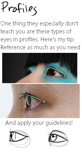
Here it is, my long winded tutorial, complete with some step by step action. I see a lot of people talk about wanting to diversify their artwork but not knowing how. This is my help to you. You really should take the time to invest in learning diverse eye shapes as diverse artwork always makes you a better artist. And frankly I’m really tired of drawing tutorials that talk up character diversity but only have the stereotypical “one Asian eye”.
I did some step by steps for those three diagrams, but I actually got them from this blog which has 14 of those examples! (Bonus: it’s a makeup blog so if you need help with that or want some idea of how to shade these eyes, there ya go)
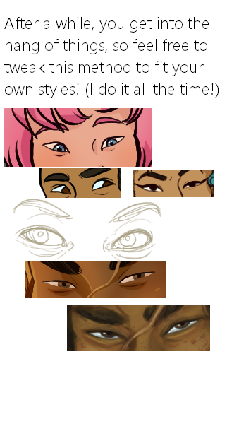
This is the coloring method I use on both of my comics (Mare Internum and The Meek), and as you can see, you can get a lot of mileage out of this technique!
It’s fast, flexible AND consistent, and you can achieve anywhere from simple cel-shading to complex textured painting… definitely my go-to coloring method for creating nice-looking art with as few layers as possible.
I create these tutorials every month for my Patrons! After six months, a lower res version of the tutorial will go public so everyone can have this info :] As always, you can access the full archive of my tutorial series and the monthly supplement here on the Shingworks Patreon.
And, thanks very much for not deleting this text~~ meow
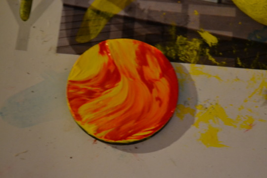
You will need: blank bases, PC-7 plumber’s putty or similar, and your choice of paint in yellow, red, white (optional), black, and silver.
Start with a base coat of solid yellow or yellow and white. On your second coat, swirl some red into your yellow until you are satisfied with the look. I did this one very quickly; you can get a more refined look with some blending or you can leave it loose. Up to you.
PC-7 has a putty-like texture, sticky but not elastic. Once mixed it can be manipulated to look like lava in the middle of cooling, solidifying but still being torn here and there in the flow.
Not much sculpting is needed. The stuff develops textures on its own as you pull and tear at it.
Now lay it on. I purposely placed the pieces on the red portions of the lava, where it is cooler than the yellow or white.
Add texture if you’d like but honsetly it’s probably fine as it is. Let it cure most or all the way.
Add a wash of diluted red. This simulates the reflected light from the lava and the places where it’s not fully cooled.
A dry-brushing of dark-tinted silver gives it the metallic sheen of freshly cool lava.
Not counting curing times, these take less than a half hour each and less if you’re working in series. Quick and cheap.