Layering technique for vibrant greens, using Dr Ph. Martin’s Hydrus liquid watercolours. 3 colours used – Turquoise Blue, Hansa Yellow Medium and Blue Aqua 🙂
fuck me yes.
When I saw this all I could think about is how you can basically use this technique with any primary colors. You want a purple color, okay lets layer some reds and blues. You like orange? Alright lets layer some reds and yellows.
Generally this is a really great technique and I will deff be experimenting with this in the future.
For my artist friends that mix colors and especially want vibrant mixes, may I suggest trying Cyans, Magentas, and Yellows in your mixes (instead of blues and reds). For luxurious purples, try Quinacridone magenta (or similar pigments) with your favorite Cyan or manganese blue… Those same blues with a vibrant yellow will make wonderful greens. Of course, there are a bajillion greens to be had in nature, and in paint, so this is just one suggestion! You get a really poppin’ great orange out of the magenta + yellow mix, too. Experiment and have fun! Transparent watercolors are especially exciting to try these vibrant pigments with.
Here is an example of the greens, oranges (admittedly knocked back in saturation by myself), and purples I get from these mixes. I layer a bit less than the above demo by sanjanasart, but this is just a color example for you. Note the really vibrant greens on the leaves, whereas I toned it down a bit in the background so that it didn’t fight too much with the gryphon and wisteria.
😮 bloody beautiful, one of the main reasons why i love watercolours
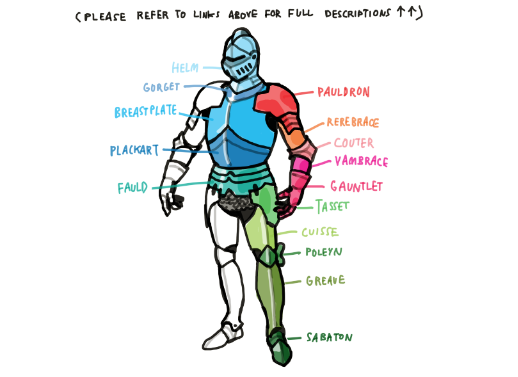
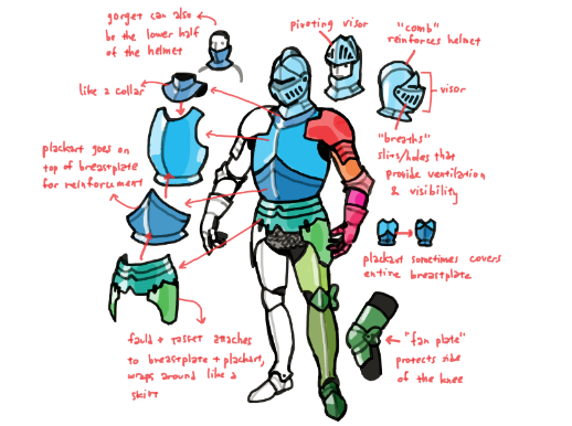
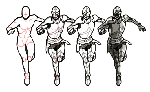
again, there are two main things i’d suggest focusing on: -studying the different parts of an armor and how they work and -visualizing the armor as 3d shapes
i found some sites that go over things like armor parts and their functions here and here, a lot of nice photo reference here, and a bunchoflabelleddiagrams on google images
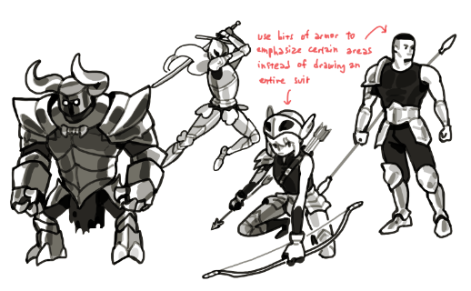
there is a lot of liberty you can take with the details, shapes, and proportions etc, (also remember, medievaleuropeisn’ttheonlyera armor comes from!) so you can use that to communicate things like the time period and culture the armor is from, the personality of its wearer, etc.
with simplifying armor into 3d shapes i’d basically just use a regular human body as a base. having a decent grasp of anatomy really helps with this i think
there is technically little or no difference between actual male/female armor, from the way i understand things at least (armor is just armor after all), but you can take a look at this post of mine for strategies you can use to make armor look more masculine or feminine
and then of course there’s that boob plate thing there are reasons why those don’t really work in real life but you could always pull out the artistic liberty card so
Beginner writers tend to write essays when they first start writing novels. Successful writers soon realise that a novel is not an essay. It is a story made up of scenes. But how do you know if you’ve written a great scene?