tealin:

All my lovely super-talented colleagues from Big Hero 6 are sharing their sexy paintings and glamorous linework, so I thought I’d leap on the bandwagon like a socially awkward Quasimodo and wave my hair diagrams around.  These were done for most of the main characters so their hair could be built in 3D in a way that would behave realistically when put through the simulation process. Each clump of hair needed to be placed and plotted so the layers built up in a way that reflected Shiyoon’s designs. It was a challenge but kinda fun for all that … I won’t get to see how it turned out until January, when the film comes out in the UK, but I hear people like it, so that’s good.

All images © Disney

hair tutorial?! please :3

rainbowthinkerart:

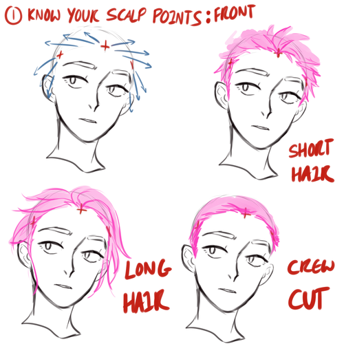
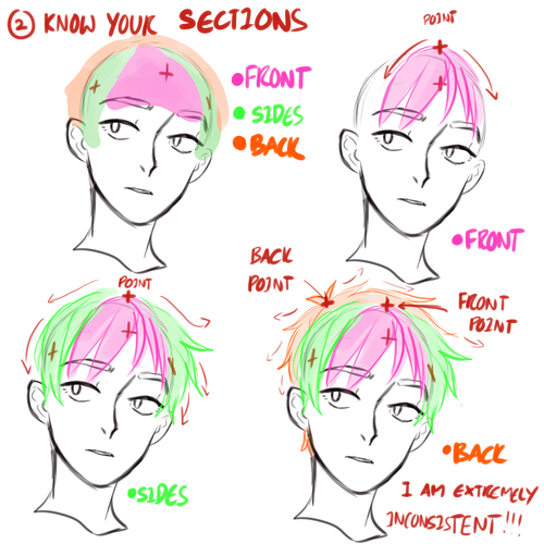
HELLO! I’m not too sure on how to make a hair tutorial since i kinda just go the hell out with it (its really inconsistent it hurts lol). But i’ll try my best!

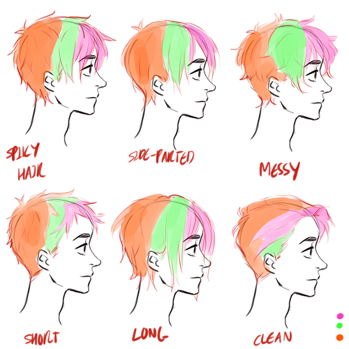
Scalp points is really important. You would want it to look natural, and from there you can control where your front hair goes. There are 3 main points, one in the middle and the other two by your temples.

I usually divides my hair sections into 3: the front, sides, and back. YOU DONT REALLY HAVE TO FOLLOW EVERYTHING THOUGH, JUST DO YOUR THANG. I know, my hair structures doesnt make sense with the points and stuffs lmao. But yeah you got my point.

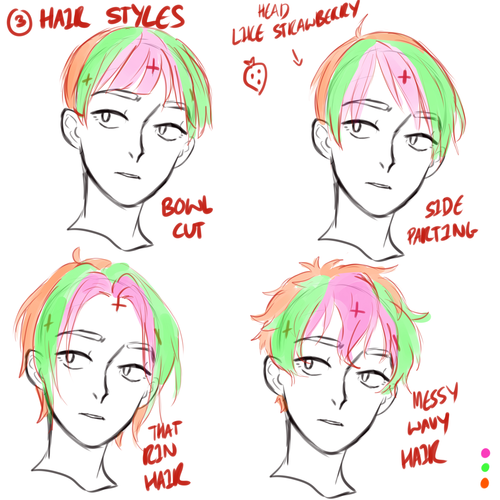
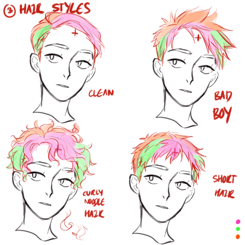
Examples with different hairstyles:

Note to self: do not attempt curly hair if you’ll just fuck things up

Side view examples:

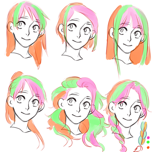
Girls Hair example:

Girls hair doesnt make sense. Just go crazy and make them fabulous queens.

So yeah, thats all i manage to think of. There are great artists out there who make better tutorials than me lmao. Check out kelpls amazing tutorials, or just look at some fancy kpop artists’ hair for reference their hair are amazing

empyreanblaze:

teabq:

socialworkgradstudents:

missknotty:

gameofreferences:

Michele Carragher, the head embroider on Game of Thrones, made this awesome tutorial to show how she created the dragonscale fabric that appears on several of Daenarys’ costumes in S3 and S4.

Ms. Carragher says that the dragonscale fabric was created because “In season 3 the Costume Designer Michele Clapton wanted a Dragonscale like textured embroidery that starts to emerge on three of Daenery’s costumes, which becomes heavier and more pronounced, growing and evolving as the season progresses” (Carragher).

In stages 9-11 of the tutorial we see how the textile evolves from lightly to heavily embellished. This progression is meant to illustrate Daenarys’ personal growth and the growth of her dragons (source).

Here’s a link to Ms. Carragher’s website.

WOW!

Don’t care about Game of Thrones but that shit is cool

I didn’t learn about sewing as much as I learned that, no matter what she currently gets, Ms Carragher isn’t paid enough.

Respect.

brilynnmatai

simonist:

here are some bits from the psg art tutorial by Arne Niklas Jansson

it’s incredibly useful and very comprehensive so please, check it out!

img 1: sub-surface scattering

Sub-surface scattering – Strong light can penetrate the surface of some materials and bounce around, then exit again. This will increase the saturation and make the surface look illuminated from the inside. In the case with human skin, we sometimes see it on hard edges between light and shadow. 

img 2: layer passes

  • Feel volume and angle of the form.
  • Where is the light coming from?
  • Try to figure out if there are any shadows that might be falling on the surface.
  • Is there any reflected light (radiosity) that hits the surface?
  • What is the ambient color of the scene? (sorta like global reflected light.)
  • Any speculars. Is the surface gloss/wet and also angled so it reflects a light source, such as the sky?
  • The exposure level. Perhaps it’s so heavily lit that it becomes more than white? Perhaps it’s so dark that even the brightest spot is hidden in darkness.
  • Is there any fog in the way?
  • The texture of the surface.

Note that this mainly goes for realistic styles. A brushstroke should also look efficient and consistent with the rest of the painting and your color scheme choice. You might also have an idea or style which disallows certain colors or textures and puts priority on other things. However, even in a powerpuff girls illustration there’s simplified elements of realistic rendering. Don’t hide behind “it’s not apart of my style so I’m not gonna learn it”.

img 3: speculars

There’s really just one kind of light. It bounces. You can only see the light (photon) if it enters your eye. Light does two important things when it hits a surface. First, a part of it is absorbed. This is how colors are made. A red apple reflects mostly red wavelengths, the rest are absorbed and turned into heat or something. That’s why black stuff get so hot in the sun. Anyways, the reflected light bounce away differently depending on the surface. If the surface is bumpy it will bounce away sort of randomly, like a tennis ball that hits rocky terrain. If the surface is smooth it will bounce away in a predictable path. A mirror is very smooth so the light comes back undistorted, so we can see our reflection.

Note that all surfaces have speculars, because speculars is just reflected light. It’s just more broken up/diluted on dull surfaces.

img 4: radiosity

Here on earth we have lots of stuff around us that the light can bounce off, so things here are more or less lit from all angles. For example we have the sky which is like a dome shaped blue light source. Then theres the ground, walls and other surfaces. In space there’s basically just one light source, the sun. This is why the moon just has a lit and shadowed side, and looks kind of flat. If you looks carefully however, you can see earthlight on the shadow side of the moon, but it’s very weak. Then there’s starlight, which I guess is even weaker.

When light hits a surface and bounces, it also change color. If it hits another surface of the same color it bounced off, it will make that surface look even more saturated.

thatsmeimmanfers:

DO YOU LIKE CELTIC KNOTS???

YEAH???

HERE’S HOW TO MAKE THEM!!


A’ight, a’ight,

What you need:

  • Graph paper
  • Pencil with a good eraser
  • Patience!

Got those things?? Good.

To start with, draw out some dots in the shape of the knot you want. Want a square knot (like the example above)? Make a square out of dots. Want a rectangle? Make a rectangle. Get good with basic shapes and you can go on to more complex shapes like borders, circles, etc. I’m going to do a rectangle one for the sake of the tutorial.

Important things to remember when making your dots:

  • No closed corners. Make sure all corners are 2 dots diagonal from each other, not a single dot.
  • Make sure the edge dots are 2 squares apart. ie: Dot, skip a line, dot, skip a line, etc
  • Fill in the entire shape with dots, but make sure they’re in the right places. This is most easily done by drawing your dots diagonally.

Next, draw short lines through every edge dot, but do not let them connect. These lines are called “splits” and are points where a section of the knot will end or split off. Your corners should look like this:

And your whole shape should look like this:

Next, add splits inside the shape wherever you’d like! This is how you’ll “design” your knot. After a lot of practice you’ll have a good feel for how your knot will look just by adding these splits.

I like symmetrical knots, but your knot can look however you want! Don’t add too many splits though. A few will go a long way. Here are the different kind of splits and how they will look:

  • One split line: A simple arc. These will be your edges and are the easiest splits to incorporate inside your knot.
  • Two split lines: These make a U shape. They will be your corners and are useful for when you want the “rope” of your knot to make a U-turn.
  • Three split lines: These are my favorite (but there aren’t any in this tutorial knot). They make cool loop-da-loops and add a splash of fanciness to your knot. However, if you’re not careful about where you place them, they can look strange.

One more type of split, which isn’t really a split at all:

Making a square of split lines, like this one, will make a hole in your knot. No “rope” will pass through these. Likewise, if you square off a smaller shape inside your main shape (leaving no openings into the small shape) the knot inside the small shape will be an entirely separate know from your main knot. (I may do a tutorial about super fancy knots that will include this concept later on). SO if you want holes in your knot, include a couple of these.

OKAY now to the tricky part. Draw short diagonal lines between all the dots that ARE NOT CONNECTED BY SPLIT LINES. If a dot is even remotely connected to a split, leave it alone. These diagonal lines represent parts of your knot that will be straight. Any other space will be filled by a curve in your knot. Here’s sort of what it’ll look like:

Now you need to add the curves. Connect the remaining dots according to their split lines. Refer to the close-ups a couple steps previous to see what I mean. It should look like this:

Notice how all the edges are arcs and all the corners are U’s, but that there are arcs and U’s inside as well. Here you can also see the how the hole in the center will look. This is the step in which you should fix any issues with your knot and add/remove splits you want/don’t want.

Next is probably the most confusing part. From the top row, choose a direction, left-to-right or right-to-left. In the top row (not the edge) draw lines connecting each intersection in the direction you choose. I usually choose left-to-right for my top row. On the next row down, go the opposite direction all the way across. IF A ROW DOES NOT HAVE ANY INTERSECTIONS, DO NOT JUST SKIP IT. TREAT IT AS IF IT DID. This means if you do a row of LtR and the next row doesn’t have any intersections, you treat it as a RtL row anyways and the following row will be LtR. If you simply skip it, the knot will not flow correctly and won’t connect in the right places. Your knot should end up looking something like this:

Now you can see roughly what your knot will look like when completed! Awesome! This is a good time to check and see if your knot is continuous. Follow your line from one point all the way around and see if you pass through every section of your knot. If you see that some of your knot was left out, there is an inconsistency in your knot. While this is fine and you can still make the knot and it will probably still look good, it’s notable that to be considered a “true” celtic knot, the knot must be continuous. But there are no celtic knot police who are going to bust down your door if you prefer to have a rad knot in pieces. If you are happy with your knot, move on! To flesh it out, outline the knot as if it were a rope. Follow the lines. If an intersection has a LtR line through it, the the topmost layer of the rope will go LtR. The picture explains this better:

Finished up, it should look like this:

Now, erase those pesky inside lines, get rid of the outer edge split lines, clean everything up and….

BLAMO!! You’ve made your very own celtic knot!! GO YOU!! You now have a mostly useless, but impressive skill that you never knew you needed!

Edited for typos…